How to Use Responsive Block Styles in WordPress 7.1
WordPress 7.1 introduces responsive block styles with mobile and tablet viewport controls. This guide explains how to use them in theme.json, customize breakpoints, style individual blocks, and test responsive designs.
On this page
WordPress 7.1 Makes Responsive Block Styling Easier
WordPress 7.1 was released on August 19, 2026, introducing a new responsive styling system that lets developers and site builders define different block styles for mobile and tablet viewports without relying entirely on custom CSS.
The feature is particularly useful for block themes because responsive values can now live inside the existing Global Styles and theme.json system. Instead of creating separate CSS rules for every responsive adjustment, developers can describe viewport-specific styles alongside their other theme configuration.
What Changed in WordPress 7.1?
Before WordPress 7.1, responsive styling in block themes often required developers to handle viewport-specific behavior through custom CSS or other theme-level techniques. WordPress 7.1 introduces @mobile and @tablet style states that can be used with supported block style properties.
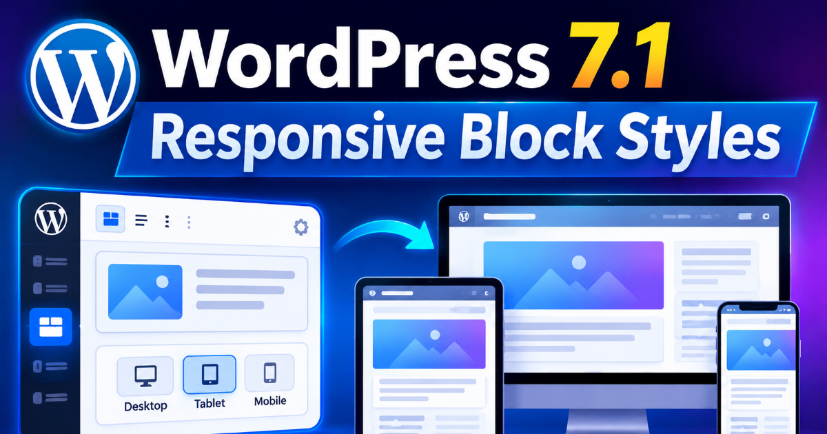
The default breakpoints are designed around common device sizes. Mobile applies at widths up to 480 pixels, while tablet covers widths greater than 480 pixels and up to 782 pixels. The normal block style remains the base style and acts as the desktop or fallback configuration.
This means you can define a desktop-friendly value first and then override only the properties that need to change on smaller screens.
How Responsive Styles Work
The basic concept is simple: the standard style is the default, while @tablet and @mobile provide responsive overrides.
For example, a theme could use a larger padding value on desktop and reduce it on mobile. The responsive settings are nested inside the block's style configuration, making the relationship between the default and responsive values easy to understand.
WordPress generates the required media-query CSS on the front end. Developers therefore work with the WordPress styling API while the platform handles the responsive CSS generation.
Using Responsive Styles in theme.json
The most important part for theme developers is the theme.json configuration. Responsive values can be placed inside the relevant block style definition.
A simplified example looks like this:
{
  "styles": {
    "blocks": {
      "core/group": {
        "spacing": {
          "padding": {
            "top": "3rem",
            "right": "3rem",
            "bottom": "3rem",
            "left": "3rem"
          }
        },
        "@mobile": {
          "spacing": {
            "padding": {
              "top": "1rem",
              "right": "1rem",
              "bottom": "1rem",
              "left": "1rem"
            }
          }
        }
      }
    }
  }
}
In this example, the group receives 3rem of padding by default, while mobile devices receive a smaller 1rem value. The default style continues to apply at smaller widths for properties that are not explicitly overridden.
Adding Tablet-Specific Styling
You can also define a separate tablet configuration. This is useful when a design needs an intermediate layout rather than simply switching from desktop values directly to mobile values.
For example, a theme might use 3rem padding on desktop, 2rem on tablets, and 1rem on mobile devices. The structure can be organized around the default style followed by @tablet and @mobile overrides.
This approach gives theme authors more control without forcing every responsive adjustment into a stylesheet.
Customizing the Responsive Breakpoints
The default breakpoints are not mandatory. WordPress 7.1 allows themes to configure their mobile and tablet viewport widths through the top-level settings.viewport property.
A theme can therefore define values such as:
{
  "settings": {
    "viewport": {
      "mobile": "30rem",
      "tablet": "45rem"
    }
  }
}
With this configuration, WordPress uses the customized viewport ranges instead of the defaults. Valid breakpoint values can use px, em, or rem. Unsupported units and invalid values are ignored.
Responsive Styling for Individual Blocks
The feature is not limited to global theme styles. Responsive values can also be stored on individual block instances through the block's existing style attribute.
For example, an individual paragraph can have a smaller font size on mobile without changing every paragraph across the site.
Responsive paragraph text.
This distinction is important. Global Styles are useful when the same responsive rule should apply consistently across a theme, while block-level styling is better when a particular content block needs a custom adjustment.
Which Properties Can Be Made Responsive?
WordPress 7.1's responsive styling system works with block supports such as typography, color, background, border, dimensions, spacing, and layout. This makes the feature considerably broader than simply changing font sizes between devices.
For example, a developer could reduce mobile padding, adjust typography, change spacing between layout elements, or modify other supported styling properties while keeping the base desktop design intact.
Responsive Pseudo-States Can Be Combined
WordPress 7.1 also introduces a more flexible system for pseudo states such as hover, focus, focus-visible, and active. These states can be nested under responsive viewport definitions.
That means a developer can create combinations such as a mobile-specific button style and then define how its hover state behaves within that responsive configuration.
A simplified structure looks like this:
{
  "styles": {
    "blocks": {
      "core/button": {
        "@mobile": {
          ":hover": {
            "color": {
              "background": "var:preset|color|contrast",
              "text": "var:preset|color|base"
            }
          }
        }
      }
    }
  }
}
This gives block themes more control over interactive designs without abandoning the Global Styles system.
How WordPress Generates the CSS
Developers do not have to manually write the media queries for responsive values configured through the WordPress styling system. WordPress generates media-query-scoped CSS and associates responsive block values with stable generated classes.
This is one of the most useful aspects of the feature because it separates design configuration from the implementation details of the generated CSS.
For layout-related responsive values, WordPress can also use existing layout support mechanisms and generated container classes. This allows responsive configuration to remain integrated with the block system rather than becoming a collection of unrelated CSS rules.
How to Test Responsive Styles
After adding responsive settings to a theme, test the result at more than one viewport size. The editor's device preview can be used to check the configured responsive behavior.
- Open the block theme in the WordPress editor.
- Apply a responsive style to a supported block.
- Check the desktop or base appearance.
- Switch to the tablet preview.
- Switch to the mobile preview.
- Confirm that the intended values are applied at each viewport.
- Test the actual front end separately before publishing.
Testing both the editor and the public-facing site is important because responsive styling affects the generated front-end CSS as well as the editing experience.
How to Disable Responsive Editing
Not every project should allow users to change responsive styles. WordPress 7.1 provides the responsiveEditingEnabled editor setting, which defaults to true. Developers can set it to false when they want to remove responsive editing controls from the interface.
Disabling the interface does not remove responsive styles that already exist in theme.json, Global Styles, or block attributes. The saved responsive configuration remains active and WordPress continues generating the associated CSS.
This makes the setting useful for controlled environments where designers should be able to use predefined responsive rules but should not modify them directly.
Responsive Styles vs Traditional CSS
| Approach | Responsive Block Styles | Traditional CSS |
|---|---|---|
| Configuration | Integrated with WordPress styling APIs | Written separately in stylesheets |
| Block awareness | Designed around blocks and block supports | Depends on selectors and custom CSS |
| Global Styles integration | Yes | Not inherently |
| Custom breakpoints | Supported through viewport settings | Fully controlled through media queries |
| Best use | Block themes and supported block styling | Advanced custom styling and unsupported properties |
Traditional CSS is not obsolete. There will still be situations where custom CSS is the better solution, especially when a design requires properties or behavior outside the capabilities of the block styling system.
Common Mistakes to Avoid
- Changing every property at every breakpoint: Use responsive overrides only where the design actually needs them.
- Ignoring the base style: The default style remains the fallback for properties without responsive overrides.
- Using invalid viewport units: WordPress supports specific length units for configurable breakpoints.
- Testing only inside the editor: Always verify the public-facing result as well.
- Replacing all custom CSS immediately: Responsive block styles complement CSS rather than eliminating every need for it.
- Using inconsistent breakpoints: Keep viewport values aligned with the design system used by the rest of the theme.
Who Benefits Most From This Feature?
WordPress block theme developers are likely to benefit the most because responsive styling can now be expressed directly within the theme configuration. Plugin developers can also use the system when their blocks expose supported styling controls.
For agencies and freelancers, the feature can reduce the amount of repetitive responsive CSS required for common block-based layouts. It can also make theme configuration easier to maintain because responsive values remain close to the other design settings.
Frequently Asked Questions
What are the new responsive breakpoints in WordPress 7.1?
WordPress 7.1 provides mobile and tablet responsive states by default. Mobile uses a maximum width of 480px, while tablet covers widths greater than 480px and up to 782px. Themes can customize these viewport values.
Can responsive styles be added to theme.json?
Yes. WordPress 7.1 supports @mobile and @tablet responsive style keys within the relevant theme style configuration.
Can individual blocks have responsive styles?
Yes. Responsive values can be stored in an individual block's existing style attribute, allowing a single block to behave differently without changing the global style for that block type.
Do I still need CSS in WordPress 7.1?
Yes. Responsive block styling expands the WordPress styling system, but custom CSS remains useful for advanced designs and properties that are not covered by block supports.
Final Takeaway
WordPress 7.1's responsive block styling system gives block theme developers a cleaner way to manage mobile and tablet design directly through WordPress's existing styling architecture. Instead of treating responsive behavior as a separate CSS problem, developers can define viewport-specific values alongside their theme configuration.
The best approach is to keep the base style as the default, add responsive overrides only where necessary, customize breakpoints when the project requires it, and test the result across real device sizes. Used this way, the new system can make responsive block themes easier to build and maintain while preserving the flexibility of traditional CSS when more advanced control is required.
Written by